Chapter 1G
Decision Execution with Quantitative Methods
 Decision Intelligence – Decision Execution with Quantitative Methods
Introducing Decision Execution with Quantitative Methods

📜 "Whenever we can replace human judgement by a formula, we should at least consider it."
-- "Thinking , Fast and Slow" (page 233) - Daniel Kahneman
When faced with any decision, it’s often tempting to “go with something simple" to make the decision. Intuition and simple rules of thumb can serve us well, especially when time is short or we’re in a familiar environment. These instinctive decisions are fast and draw on our experience, but they have limits. Left unchecked, our gut feelings can introduce bias. Simple decision rules can often oversimplify a complex situation. This is why the quote above from Daniel Kahneman is quite consequential. Basically, Daniel Kahneman is claiming whenever when we have the time or the decision is sufficiently important, we should consider using a formula (quantitative calculation based on math, probability or statistics).
Quantitative methods offer a powerful complement to intuition and decision rules for decision execution. By bringing math, statistics and data into the decision-making process, we get a structured process to weigh decision options. Instead of relying on instinct or simple rules, we can analyze evidence, attach probabilities to possibilities, and objectively compare alternatives. This structured analysis makes it easier to verify assumptions and measure results, leading to clearer reasoning and better decision quality. While this might sound complex, the core idea is simple: by applying structured reasoning and calculated numbers, we reduce future uncertainty and make more informed choices.
Another big advantage of quantitative decision-making is how it handles uncertainty and trade-offs. Real decisions often involve unknowns and future uncertainty, where a lone intuition might misjudge risks or focus on the wrong factors. Many research studies show quantitative methods consistently lead to higher-quality decisions. For example, one recent study found that data-driven organizations are three times more likely to significantly improve their decision making than those that rely on intuition alone; even besting expert human judgement. Therefore, turning decision information into concrete values and probabilities, we greatly reduce uncertainty and gain confidence in the choices we make.
📝 EXPLANATION
You have seen some simple math formulas in the previous "Decision Execution with Decision Rules" section. What is the difference between the math in this section? The calculations needed to be performed for Decision Rules are quite simple and the formulas have already been defined ready for use. For example, the "10,000 Step Decision Rule" is simply implemented by gathering information on the amount of daily steps and comparing it to the 10,000 step decision threshold. You are just plugging in gather information to a decision rule to execute a decision. Whereas using more advanced quantitative methods you may first use your own body composition to create an optimized formula that is different than 10,000 steps (9,550 steps). Decisions that are less defined require a breadth of more quantitative tools.
Math is hard for Humans. Like Really Hard!
Humans are naturally bad at math. While we’ve built complex mathematical systems and advanced sciences, our brains simply weren’t designed to handle numbers intuitively. Exceptinonal humans invented all of the mathematical advancements over thousands of years. To name one example, Isaac Newton before turning 26 years old came up with the laws of motion and invented calculus! However, most of us struggle with the basics: large numbers, fail at simple fractions, and often don't use probabilities correctly. Rather than talk about many different background reasons, let's illustrate this with some material examples.
The most basic example in mathematics is counting numbers (1, 2, 3, 4, 5...). However, once we get to large numbers interesting things start to happen with being able to grasp the enormity of some extreme numbers. Studies have shown that people can’t truly internalize the difference between a million, a billion, and a trillion; leading to major misconceptions and poor decisions. Let's do a simple comparison of a million and a billion dollars. Let's hypothetically say that you have two bank accounts; one with a million dollars and one with a billion dollars. You could withdraw $100,000 each year from each bank account. The bank account with one million dollars would last 10 years before going to $0. Conversely, the bank account with a billion dollars (even with withdrawing the same monthly $100,000) would last 10,000 years! Did framing this comparison make you say "Wow"? Most people know a billion is much larger than a million and that they would prefer to have a billion dollars over a million dollars. However, most people can't grasp the size of the differences. However, this is where doing mathematical comparisons helps us grasp the information needed for decisions.
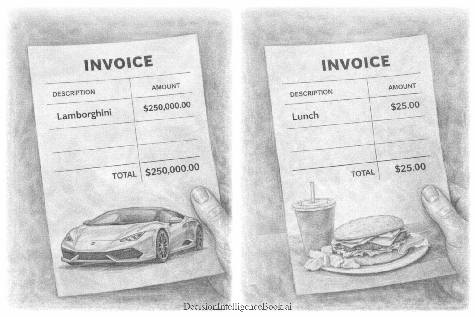
One of the areas where these large numbers are hard to grasp the purchasing power of extreme wealth. In the same manner above, it would not be shocking for someone to understand that a very wealthy person can just buy a multiple very nice cars. However, when comparing spending power, that is when the differences can be illustrated. For example, one can compare a wealthy person’s spending on a Lamborghini to an average person spending $25 on lunch by simply looking at the proportion of their wealth or income that each expense represents. For a billionaire, **a $250,000 luxury car might be just 0.025% of their $1 billion net worth—the same way $25 is 0.025% of $100,000 (an average annual income)!!** In both cases, the purchase takes up the same tiny fraction of their total financial resources, making the Lamborghini feel as “affordable” to the billionaire as lunch does to the average person. To give another perspective a Lamborghini purchase to a billionaire is a simple as grocery list item. This comparison is called relative spending or spending as a percentage of wealth.
These invoices below are vastly different mathematically. However, the relative spending comparison from a billionare to a middle-class person is equal!
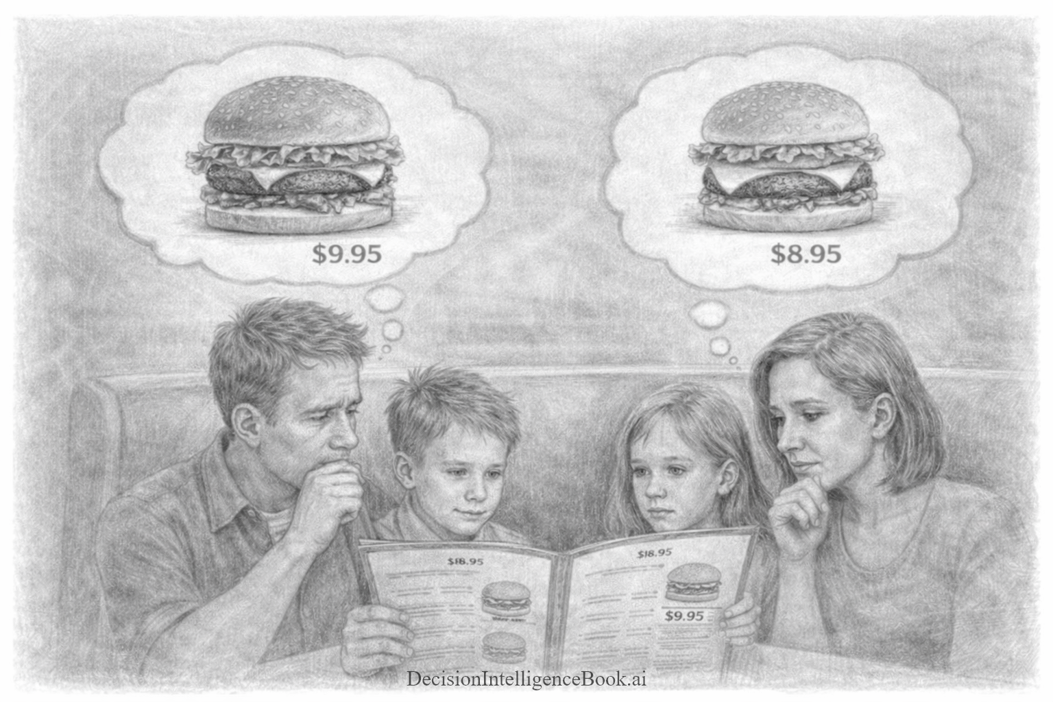
When a Bigger Burger Looked Smaller: A&W’s Fraction Problem
Let take a look at how poor math skills & decision-making translates into business impact. One famous & humorous example where simple understanding of math has had dramatic impact in business is A&W's Restaurants failed attempt to compete with McDonald’s Quarter Pounder.
In the 1980s McDonald's restaurant chains were starting to become a dominant restaurant chanin. However, they were the global juggernaunt they are today. McDonald's did not have a huge presence in Eastern Europe, Asia, South America etc. A&W Restaurants saw an opportunity to compete with McDonald's leading fast food sandwich the quartner pounder. As you know know the McDonald's quarter pounder includes a 1/4 pound meat patty.
A&W Restaurants decided to introduce a 1/3 pound burger at the same price and with higher quality beef, thinking customers would see the obvious value in more burger meat for the same cost. An entire nationwide marketing campaign was created around this promotion called "Third is the Word". This marketing campaign was a marketing flop as it did not lead to more A&W burger sales. A&W Restaurants sought to understand why by creating a focus group. The outcome was a complete surprise: a plurality of consumers assumed that 1/3 was SMALLER than 1/4 because “4 is bigger than 3”! Basically, most consumers were math illiterate and didn't understand they were getting a better deal with the 1/3 A&W burger.
This famous example is sometimes hard to imagine is real, so A&W have a dedicated web page confirming it's reality. A&W Restaurants has videos and case studies posted on this. The business scenario became so famous, it has its own Wikipedia page about it: https://en.wikipedia.org/wiki/Third-pound_burger
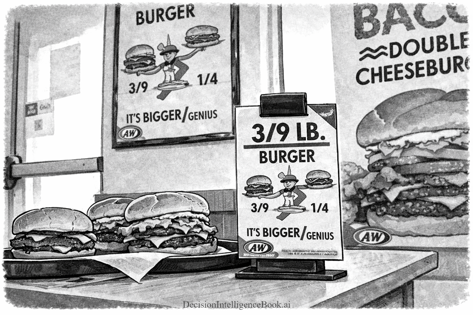
In a twist, years later A&W Restaurants used poor consumer math understanding to their advantage and introduced a marketing campaign of a 3/9 burger. As you probably know 3/9 is the same as 1/3. However, A&W Restaurants used the number 3/9 to show a larger denominator in the fraction to burger customers to play on their perception that 3/9 is somehow a bigger burger and thus a better deal!
The Value of Quantitative Methods (Performing Math)
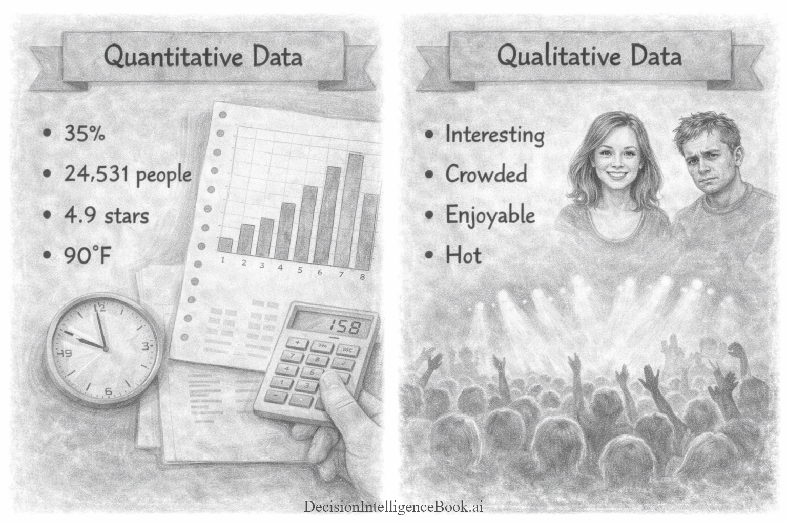
Let's do a quick primer on two fundamental forms of data you will work with when making decisions. There are two common types of data: quantitative and qualitative. Quantitative data is numerical and measurable. Examples of quantitative data are things like dollars, time, counts, percentages, and rates. These are things that you can perform math on (add things up, average them, compare trends). Qualitative data is descriptive. This includes things like comments, interview notes, observations, and themes. Because qualitative data is not numerical, it has less options for analysis. It can be counted, summarized, grouped into categories, to identify patterns to understand context and “why” something is happening. This is valuable, but does not have the same power as quantitative information.
📝 Note: There is a special sub-type of qualitative data called ordinal data, which is qualitative data where there is a prescribed ranking or order. For example, ranks in the army would be considered ordinal as there an specific order: General, Colonel, Major, Captain, Lieutenant etc. In this resource, we will treat ordinal data sets simply as qualitative.
Let's take a look at several analogous examples of qualitative vs quantitative data below:
- You can describe a rock concert qualitatively as "crowded" or more explicitly with the exact quantitative observed count of attendance (24,531)
- You can describe a movie that you have seen as "Enjoyable" or quantify the movie experience as 4.9 stars (out of 5)
- When you walk outside on a summer day, you describe the weather as "Hot" or you can look at your weather app and receive an exact quantified number like 90 degrees Farenheit (32 degrees Celcius)
These types of descriptive statistics have some value alone, but they begin having more impact when you can do additional math. For starters, simple qualitative data can be compared and counted. For example, you can count the number of "Hot" days in a year and the number of "Cold" days in a year. Furthermore, you can take those counts and compare how many more "Hot" days there were versus "Cold" days. Additionally, you can do analysis like order the days from "Cold" to "Hot" to get a distribution of weather descriptions for a full year. However, qualitative data analysis falls short when you want to start doing things like: "How much hotter was it today than yesterday?", "What is the percentage change of weather temperature from yesterday to today?". You can try to subract two "Hot", "Mild" or "Cold" weather days. However, what would the answer be? For example, what is the answer to this difference between a "Hot" and a "Cold" day: "Hot" Day - "Cold" Day? There is no answer as the question makes no sense. However, if you have quantitative measurements (temperature), that subtraction equation makes much more sense. For example, you can subtract: 90 degress Farenheit - 80 degrees Farenheit = 10 degrees Farenheit difference.
Below are some simple examples of analysis you can perform with quantitative data that are hard or impossible to do meaningfully with only qualitative labels, but they’re straightforward with quantitative measurements like temperature:
- Day-to-day difference (subtraction). Example: 90°F today − 80°F yesterday = 10°F warmer.
- Percent change (relative difference). Example: (90 − 80) / 80 = 0.125 → 12.5% warmer than yesterday.
- Average temperature over a period. Example: Average high this week = (78 + 80 + 82 + 79 + 81 + 83 + 80) / 7 = 80.4°F.
- High–low range (spread) in a day or month. Example (day): 88°F high − 70°F low = 18°F range.
- Example (month). Max daily high 95°F − min daily high 72°F = 23°F spread.
- Trend over time (warming/cooling rate). Example: Average highs rose from 75°F last week to 80°F this week → +5°F week-over-week.
When you have qualitative and/or quantitative data, you can beging performing analysis to make better decisions. Qualitative data helps decision making by allowing analysis by reading it, grouping it into themes, and counting what comes up most to understand the main priorities. Quantitative data helps decision making by giving you numbers you can measure and compare, so you can do math like totals, averages, trends and differences to see what is changing and which option performs better. Let's look at some simple examples:
- If your decision frame is to optimize value, you may observe the cost of two different price points for a product at different stores. Performing simple math allows you to compare the difference and select which store offers the optimal value. In that same decision context, if your decision frame is to optimize quality, you may look and count up the products that you observe to be built/grown/crafted better than others. You would accomplish this by grouping the observed higher quality products and comparing the counts for a decision factor.
- If your decision frame is to minimize risk, you might combine qualitative and quantitative signals. For example, you could read customer reviews to tag recurring issues (“breaks quickly,” “hard to return,” “inconsistent sizing”) and also compare the return rate or warranty claim rate across brands. A brand with fewer repeated complaint themes and a lower return rate can be considered the safer choice.
- If your decision frame is to increase revenue, you might compare conversion rates for two marketing messages (quantitative), and also review open-ended responses like “I didn’t understand the offer” or “pricing felt unclear” (qualitative). The numbers tell you which message wins; the comments tell you what to change to win by more. These combines signals can be used to optimize the decision path.
- When hiring a new employee, your decision frame might be to choose the best hire based on quality of fit. You may have candidates that are too expensive or candidates that don't fit your desired culture. Therefore, you might score candidates on a rubric (skills test score, years of experience, portfolio rating) and also analyze interview notes for themes (communication clarity, customer empathy, learning mindset). The quantitative rubric helps consistency; the qualitative themes help capture nuance that numbers miss.
As you can see the above examples, highlight how you pair the proper decision frame, gather the appropriate qualitative/quantitative data points and do simple math to perform comparisions to optimize decisions with calculated information.
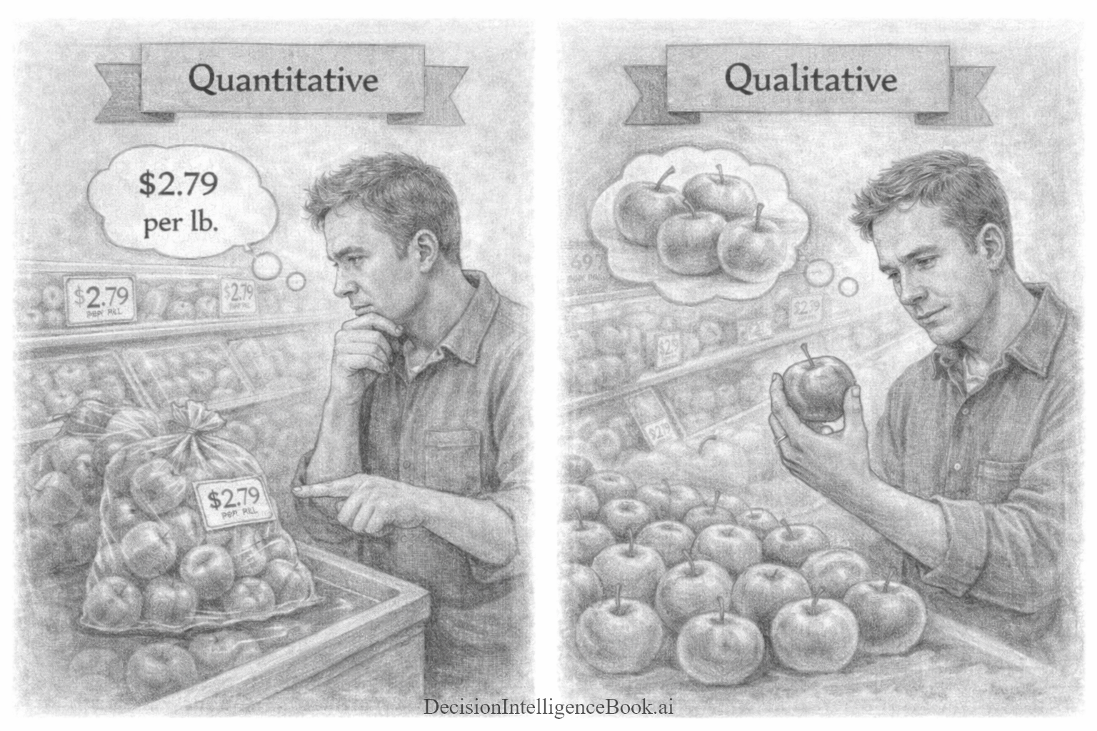
Let's illustrate this below with a simple example. We all have been grocery shopping. We optimize our decision selection based on the type of fruits and vegetables. Some make sense to optimize for value (price) and others make sense to optimize for (quality). For example, consider buying a bag of apples. Most instinctively will use the quality optimization decision frame, as even though there is nothing wrong with a couple bruises with apples, we like eating into a nice looking apple. Perhaps our kids won't eat "bad" apples. Therefore, the illustration below highlights how we approach the problem two different ways, but also use math based on that decision frame differently. For a quantitative decision frame optimizing cost (price), you simply use lower cost as the driver to make the selection of a bag of apples. Contrast that with a qualitative decision frame optimizing quality, you observe how many apples appear "consumable".
Quantifying Uncertainty (Working with Probabilities)
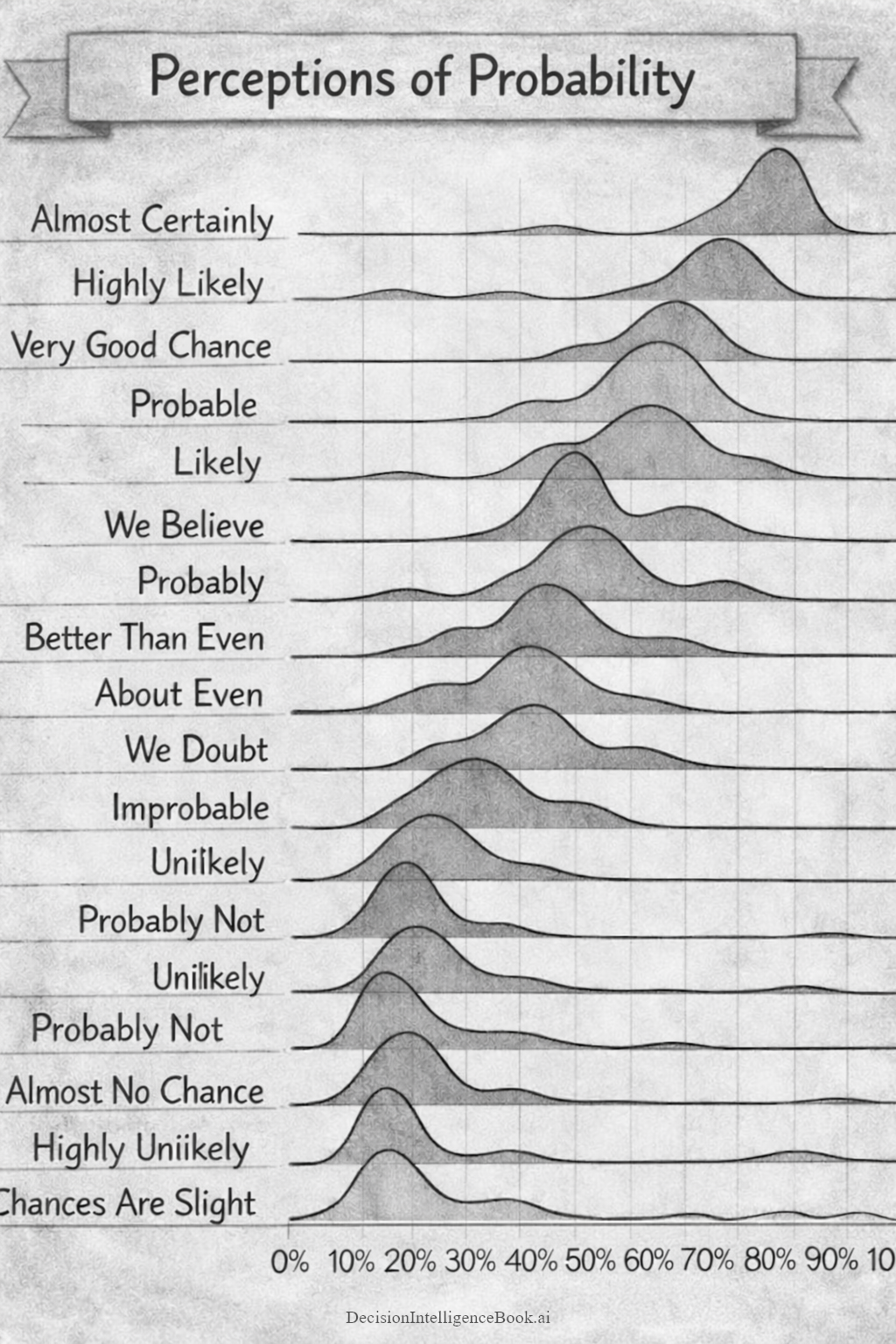
The data visualization above shows that probability (forecasting) words do not have one universally understood numerical meaning. Each row represents a phrase such as highly likely, probable, about even, or highly unlikely. The horizontal axis runs from 0 to 100 percent, and the shaded curve shows the range of probabilities that people may associate with that phrase. The highest point of each curve represents the interpretation people are most likely to give it, while the width of the curve shows how much interpretations vary.
For example, "Almost Certainly" is concentrated near the upper end of the scale with a peak of 80 percent, while "About Even" is centered near 50 percent. But many of the other phrases overlap substantially. A person hearing "Likely" might interpret it as roughly 60 percent, while someone else might hear the same word and think 75 or 80 percent. Likewise, phrases such as "Probably", very good chance, and we believe can cover overlapping ranges. The data visualization's main message is therefore not that every phrase has an exact numerical translation. It is that verbal descriptions of uncertainty are inherently ambiguous.
Sherman Kent encountered this problem in intelligence analysis. Analysts routinely wrote that an event was "Probable", "Unlikely", or "Almost Certain", but senior decision-makers did not always interpret those terms in the same way the analysts intended. Kent’s “Words of Estimative Probability” sought to connect verbal expressions with more consistent probability ranges. This helped intelligence estimates communicate not only what analysts believed, but also how strongly they believed it.
For quantitative decision-making, numerical probabilities are more useful because they can be compared and combined mathematically. We cannot calculate "Likely" × "Unlikely" because those words do not have fixed numerical values. But we can work with 70 percent and 10 percent.
Suppose there is a 70 percent chance that a product will pass its technical tests and, independently, a 10 percent chance that customer demand will be weak. The probability that both independent events occur is: 70% × 10% = 7%
Therefore, the forecast states there is a 7 percent (7%) chance that the product passes its tests and still encounters weak demand.
It is super important to understand that once uncertainty or risk is expressed as a probability, it becomes something we can work with mathematically. That opens the door to much more than simple multiplication. Probabilities can be used in forecasting, simulations, expected-value calculations, scenario analysis, Bayesian updating, insurance pricing, medical diagnosis, weather prediction, credit scoring, and many other forms of probabilistic analysis.
A Probabilistic Sports-Betting Example
Suppose a basketball team has a 60 percent chance of winning a game. A sportsbook offers a bet where you risk $100 and receive a $100 profit if the team wins.
The expected value is:
- 60% chance of winning $100
- 40% chance of losing $100
Expected value = 0.60 × $100 + 0.40 × −$100 Expected value = $60 − $40 = $20
The bet has an expected value of +$20 per $100 wagered.
That does not mean the bettor will earn $20 on this one game. They will either win $100 or lose $100. The expected value becomes meaningful over many similar bets. If the 60 percent estimate is accurate and the same opportunity is repeated many times, the average result should move toward a $20 profit per bet.
Now suppose the sportsbook pays only $60 profit on a $100 wager. The calculation changes to:
0.60 × $60 + 0.40 × −$100 = $36 − $40 = −$4
Even though the basketball team is more likely to win than lose, the bet now has a negative expected value. This illustrates an important lesson: a likely outcome is not automatically a good decision. The payoff matters just as much as the probability. This was all possible to calculate with math and applying simple statistical probability. Imagine trying todo this with estimates like "Likely" or "Maybe" the basketball team will win, the math would have a very high variance and it would be near impossible to make decisions quantitatively.
Behind the scenes each sporsbook operates like a casino. It is all based on math and statistics. All the different payoffs from bets are all calculated with math, probablity and statistics. The sportsbook doesn't always win, but it optimizes its chances of winning using those techniques. Over the long-run, the sportsbook will always likely win. The good news is as a great deal of sports betting is done by quantitative analysis (math), everyday players who can craft better betting models, have better information and can make better forecasts; can have an edge over a sportsbook.
Arriving at Quantitative Conclusions using Simulations
📜 Dr. Strange: "I went forward in time... to view alternate futures. To see all the possible outcomes of the coming conflict."
📜 Quill: "How many did you see?"
📜 Dr. Strange: "14,000,605."
📜 Stark: "How many did we win?"
📜 Dr. Strange: "...One."
-- Dr. Strange, Quill, and Stark (Avengers: Infinity War)
Imagine you need to climb a ladder to change a lightbulb. Instead of pulling out a calculator to precisely compute the ladder’s weight distribution, friction, or the exact roughness of the floor, you give the ladder a quick shake. If it wobbles dangerously, you adjust it; if it feels steady. If it seems sturdy enough and you proceed to climb the ladder.
Each shake is like a mini-simulation of the physical forces that could tip the ladder. You’re sampling a few possible disturbances to see how the ladder holds up. By shaking the ladder, you’re testing how it will behave under slightly different conditions. You move it a bit forward, a bit backward, a gentle nudge or a harder push; all without needing to know every detail of physics at play. If the ladder remains sturdy through these random “what-if” tests, you gain confidence that normal movements (like you climbing up) won’t cause it to slip. This simple practice replaces complex quantitative calculations with an intuitive experiment, demonstrating how a trivial simulation helps us gauge stability with imperfect information.

Simulations in Decision Forecasting
The ladder simulation is an example of how mathematical simulations aid decision-making. In real-world decisions we almost never have perfect information. For example, when forecasting the economy, planning a project, or predicting the weather there are too many unknown variables that can impact the outcome. Instead of trusting a single set of assumptions (which is like climbing the ladder without testing it), analysts build a model of the situation(s) and then “shake” that model by trying many different inputs and scenarios. The idea is to see how the outcomes might change if certain factors turn out differently than expected.
By using simulations, decision-makers can explore a wide range of “what-if” scenarios without needing exact data for every variable. For example, a business might simulate how different sales numbers, costs, or market conditions affect its profits, rather than assuming one fixed plan. A weather model might be run multiple times with slight changes in initial conditions to see various possible storm tracks. Each run of the model is like one shake of the ladder – a trial to see what could happen.
Simulation methods offer several benefits for making decisions under uncertainty:
- Explore "What-If" Decision Scenarios: Simulations let you experiment with different assumptions (e.g. best case, worst case) to see how each scenario might play out, without committing to a single decision prediction upfront. This reveals how sensitive your outcomes are to changes in uncertain factors.
- Visualize a Range of Outcomes: Rather than one definitive result, a simulation produces a spread of possible outcomes and estimates how likely each outcome is. Basically you get a probability distribution of results. For instance, a simulation may show 80% chance of exceeding a sales target or a 10% chance of a project running very late. This is far more informative than relying on a single guess, and it allows for better decision-making under uncertainty.
- Assess Decision Risk and Extremes: Because simulations consider many random trials, they help identify the risks of extreme outcomes. You can see the “Black Swan”events that might be disastrous (or extraordinarily successful) and gauge their impact. In fact, running many simulated trials effectively allows you to account for risk in your analysis by observing how often bad outcomes occur. Two recent real-world examples of this is the many models that did not account for the 2008 financial crisis or the 2020 disruption caused by the Covid-19 pandemic.
Introducing the Monte Carlo: Running Thousands of "What-If" Decision Scenarios
One of the most widely used simulation techniques is Monte Carlo simulation. Named after the famous casino town (due to its reliance on random chance), Monte Carlo simulation is essentially a way to model uncertainty by running a scenario over and over with various inputs. Instead of shaking a physical ladder, you let a computer shake your virtual model. For example, if you’re forecasting future sales, a Monte Carlo model would randomly vary key factors (market growth, customer behavior, etc.) within plausible ranges and calculate the outcome thousands of times. By doing so, it builds up a broad view of possible futures.
Monte Carlo methods use repeated random sampling to explore outcomes. Unlike a single-point forecast, which uses fixed inputs, a Monte Carlo simulation runs the model with a variety of values for uncertain factors. Each trial might pick a random value for, say, future inflation rate, within an expected range. Then it computes the result (e.g. company profit) and repeats this process with a new random draw for each uncertain input. Over many iterations, this produces a large number of possible results. In a typical Monte Carlo experiment, the model can be recalculated thousands of times with different random inputs, yielding a wide array of likely outcomes. What do we get from these thousands of “what-if” trials? Essentially, we get a distribution of outcomes. Monte Carlo simulation furnishes decision-makers with a range of possible outcomes and the probability of each outcome. Therefore, instead of saying “We predict next year’s profit will be $1M,” a Monte Carlo result might say, “There is a 50% chance profit will be between $0.9M and $1.1M, a 25% chance it’s higher, and a 25% chance it’s lower.” This is incredibly powerful as it reveals the spectrum of possibilities and extreme cases. It then allows decision-makers to allocate an appropriate amount of risk or opportunity mitigation for those extremes.
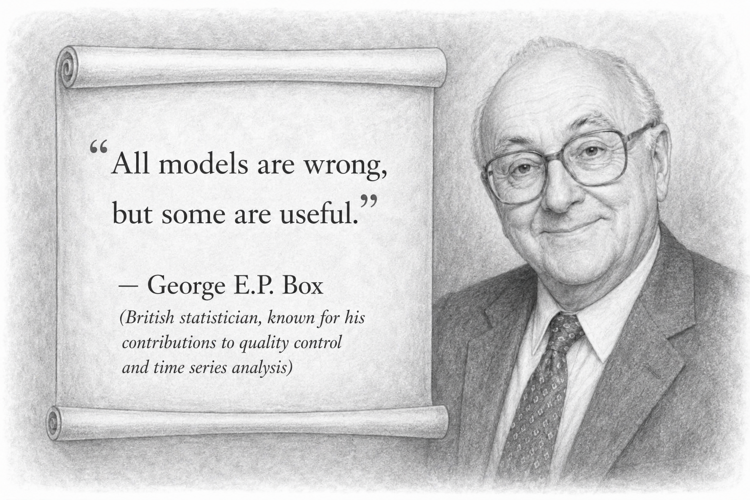
It is important to note that simulation-based decision-making is about getting “good enough” intelligence, not delivering a perfect decision forecast. Obviously no simulation can capture reality in full detail. The ladder shake test, for instance, isn’t a flawless physics calculation. In fact, the pattern in which you shake the ladder with your hands might not exactly match the forces that will occur when you’re standing on it. Yet it’s still a very useful test. Repeated often enough, the ladder shake test can become a useful model because each trial reveals patterns: how much movement is acceptable, which surfaces create instability, and what warning signs appear before the ladder feels unsafe. The test does not need to reproduce reality perfectly; it only needs to be consistent and informative enough to help execute the decision to climb the ladder.
Even if your shaking doesn’t perfectly mimic every real force, it can still reveal a loose screw or a weak rung before you climb. The same applies for mathematical simulations. The quality of the output depends on the quality of the input assumptions (and we should be as reasonable as possible with those), but we don’t need perfect precision to benefit. By understanding the broad set of possible outcomes, we can make better decisions under uncertainty, which are decisions that are resilient across different scenarios.
Decision Scenario: Monte Carlo to Determine Total Cost of Car Ownership
When people compare cars, they often focus on the sticker price, the monthly payment or a single variable. That is too narrow for a high-stakes decision. A better question is:
What will this vehicle actually cost to own once fuel, insurance, maintenance, repairs, fees, taxes, and resale value are included over time?
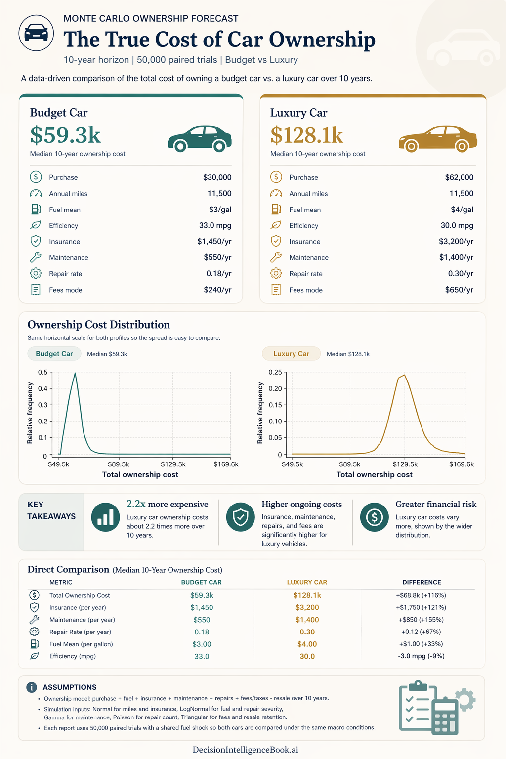
This is exactly the kind of problem Monte Carlo simulation handles exceptionally well. Instead of assuming one fixed future, the model can run 50,000 paired trials across a 10-year ownership horizon. In each trial, uncertain inputs are sampled from probability distributions: annual miles and insurance are modeled as Normal distributions, fuel and repair severity as LogNormal, maintenance as Gamma, repair count as Poisson, and fees plus resale retention as Triangular. The result is not a single-point estimate, but a range of likely ownership costs. This range can be plotted as a distribution (shown above).
Under the assumptions in this scenario, the Budget Car has a median 10-year ownership cost of $59.3k, while the Luxury Car has a median cost of $128.1k. The budget profile begins with a $30,000 purchase price, 11,500 annual miles, $3/gal fuel, 33.0 mpg efficiency, $1,450/year insurance, $550/year maintenance, a 0.18/year repair rate, and $240/year in fees. The luxury profile begins at $62,000, also assumes 11,500 annual miles, but uses $4/gal fuel (premium over regular), 30.0 mpg efficiency, $3,200/year insurance, $1,400/year maintenance, a 0.30/year repair rate, and $650/year in fees.
The most important insight is not only that the luxury car costs more, but that its cost distribution is visibly wider. A wider distribution means a broader range of plausible outcomes and therefore more uncertainty. In decision terms, the luxury option is not just more expensive on average; it is also less predictable and carries more downside exposure. The budget option is both cheaper and more concentrated around its expected range. In this decision scenario the 50,000 simulations illustrated that even in the most expensive realistic case for the budget car and the cheapest realistic case for a luxury car the distributions don't overlap. This is not always the case and this can become a very powerful decision-making driver as well. For example, if this scenario was simulating an EV (electric vehicle) with tax credits with high gas prices can push the total cost of ownership much cheaper.
If the decision frame is to optimize financial efficiency and reduce downside risk, the Budget Car is clearly the stronger choice in this scenario. If the Luxury Car is still preferred for comfort, performance, status, or brand experience, the simulation makes the trade-off explicit: the buyer is accepting both a higher expected cost and a wider band of uncertainty around that cost.
Decision takeaway: Monte Carlo simulation turns a vague question like "Can I afford the nicer car?" into a quantitative one: "Am I willing to choose a cost profile that is both higher and more uncertain?"